Showing posts with label design. Show all posts

Monday, October 19, 2009

WESTWOOD WALLS


Cole & Sons, £55 per roll

Vivienne Westwood wallpaper produced by top British wallpaper manufacturers Cole & Sons.

Visual noise all up in my kitchen and boudoir? Yes, please.
Click here to see other prints.

Friday, August 28, 2009

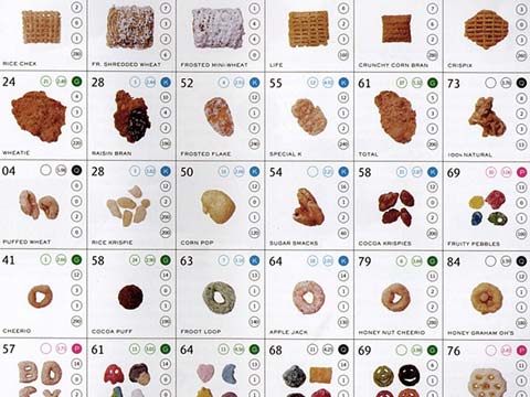
BREAKFAST PERIODIC TABLE


Gastronimica: The Journal of Food and Culture, vol. 9, no. 2, p.122. 2009 by Catherine Weese.

"Cereal is an emblem of industrial artifice, and this table addresses it's design evolution. After extensive research in the supermarket breakfast-foods aisle, I divided the cereals I found into five categories based on shape: the square or orthogonal, the flake, the "grain", the round and its variations, and the "fake". The table orders them in rows by shape; within each row they are in chronological order according to the date of their introduction into the market (indicated by the "elemental" number on top left). Subsidiary information includes nutritional data, price (which is no longer up-to-date), and manufacturer.

Over the course of my research I was struck by how American breakfast cereals, perhaps unwittingly, participated in the design trends of the times. The gridded shape of Shredded Wheat, the first mass-marketed cereal (1894), celebrates the industrial process and the prospect of uniformity. The flake and grain are stylized renditions of cereal's natural origins, an almost Arts and Crafts sensibility. The next geometric shape to appear on the market was the ball (Kix, 1937); its abstraction, subverted by playful connotations, ushered in a new era of cereal that targets children. Finally, the "fake" cereals emerging in the 1950s brought in the postmodern era, in which cereal pretends to be something else. My personal favorite in this category is Crunchberries (1968), and breakfast cereal imitating breakfast cereal. Its square pillows and red berries are a miniaturized version of Shredded Wheat with Raspberries, as depicted on the product's box. Thus, cereal completes its tour of twentieth-century design, from early modernism to wistful anti-industrialism to cheeky postmodern quotation."

....a really entertaining article in Gastronomica's Spring issue. I couldn't find Weese's full table online so this will have to suffice. If you're interested in this food quarterly feel free to email me-- I'll lend ya a copy!

Friday, April 25, 2008

Slow and Steady Wins the Race

Entry No. 8 Shirt: The Zip

I recently stumbled upon another great label at Stand Up Comedy called Slow and Steady Wins the Race. Like Pelican Avenue, SSWTR is a concept label whose attention is paid to the basic fundamentals of clothing design: the white t-shirt, seam, color, handbag, shoe, designer underwear (with a particularly interesting tribute to Calvin Klein-- lord of underwear design and advertising), evening wear, etc. Basing every new entry around one concept, it is then manifested into a few clever variations.

A new focus is introduced twice a month (in the form of an entry and then archived into a journal) and with only one hundred of each piece produced-- every single item priced at $100.00. This steady pace of release is a challenge to the commercial fashion industry's (Gap, H&M, etc) perfunctory nature; with new styles being produced, more categories are coming into existence. A sense of control is nothing more than illusive at this point. So, utilizing the simplest and cheapest materials, SSWTR designs smart, sophisticated, yet extremely basic (in concept) clothes in reaction to this reality (hence the name). Limiting the number of pieces and expensive material, the label is promoting a more utilitarian and democratic fashion lifestyle and community. 

I purchased these today! I'm in love with my shoes.

Entry No. 15 Shoe: The Wedge Sandal (made from unbleached canvas)

A few pieces can be found at Stand Up Comedy on 811 E Burnside Portland, OR 97214

Wednesday, April 23, 2008

Pelican Avenue


I discovered Pelican Avenue while perusing a local shop's website, Stand Up Comedy. I was enamored with this suit and had to find out more. Pelican Avenue was created in 2004 by Carolin Lerch, a graduate student from Antwerp Academy of Fashion. Her mission is to create clothes that reflect personal ideas and concepts. Breaking away from the physical molds and barriers of fashion vogue and hype, her pieces challenge conventional threads.

Each idea is like a collection in itself. Her reflections are conveyed through installations, video, performance, or photography and then accompanied by her clothing creations. Here are some pieces that I really enjoy:


Pelican Avenue only makes a few of every piece so it's fairly exclusive. Luckily, there's a shop in my city that carries the label (I believe there were only 10 of that particular bathing suit in existence and is now sold out at said shop). So! If you want to get your dirty little paws on some of this then head out to Stand Up Comedy!

Stand Up Comedy is located at 811 E Burnside Portland, OR 97214
Visit! It's awesome.

Sunday, April 20, 2008

May Tee


A friend of mine recently launched her first clothing line May Tee. The autumn/winter line Soft Sculptures, influenced by the Japanese stone sculptures of abstract expressionist sculptor Isamu Noguchi, incorporates unique details that reflect her interpretation of Noguchi's work. Pleats and strange tucks will catch the eyes of those who naturally pay attention to great detail.

I checked out her trunk show at Mario's yesterday and was very pleased with her ten-piece collection and the mega turn out! It was great to see so much traffic on the women's floor in support of May. I tried on the wool jersey dress (on mannequin, also comes in black or cobalt blue) and automatically fell in love. Check her out!

Featured in:

About Me

My photo
Portland, OR
Keeping my readers classy one post at a time.

Blog Archive